


Catering: write an irresistible e-mail marketing campaign in 5 steps
August 01, 2025
You send e-mails to your customers, but you don't know whether they're read, engaged or ignored? You're not alone. Many restaurateurs miss out on this easy-to-activate lever.
Customers read their e-mails between subway stops or in the supermarket queue. And if the object doesn't make you want to click, no one will know what you were offering.
But when used properly, a e-mail campaign can drive traffic, build customer loyalty and boost orders.
In this article, we show you how to write a marketing e-mail that's simple, clear and useful for your customers. In 5 steps, tailor-made for foodservice.
Step 1: optimize the subject line (50% of success is at stake here!)
The object line is the first filter. If it doesn't appeal, your email will end up in the trash, read or unread. And even if the offer is good, it won't change a thing.
Emotion + urgency + personalization
A good object attracts the eye, arouses emotion or curiosity, and prompts a click.
What works well in restaurants:
✔ Emotion: play on conviviality, gourmet delights, or a simple souvenir to share
✔ Emergency: point out that there are only a few days, places or portions left
✔ Customization : first name, favorite food, birthday... anything that shows you're talking to the right person.
You can also try out emojis (in moderation), or a colloquial turn of phrase that breaks with the usual tone.
Test your objects (A/B Testing)
Nobody gets THE formula right the first time. What works for one fast food will not work for a bistro or a leisure complex. The only way to progress is to test.
Choose 2 different subject lines for the same e-mail, and see which one gets the best open rate. Test only one element at a time (an emoji, a specific word, a shorter structure...). If you change everything, you'll never know what made the difference.
Step 2: Make your content readable in 5 seconds
When a customer opens your e-mail, you have a few seconds to make them want to read (and act). If they don't immediately understand what you're proposing, they'll move on to the next e-mail. The key is to get to the point, without losing impact.
The golden triangle: visuals, catchphrases and value
It's all about the first visible zone at the opening. This golden triangle must contain three clear elements:
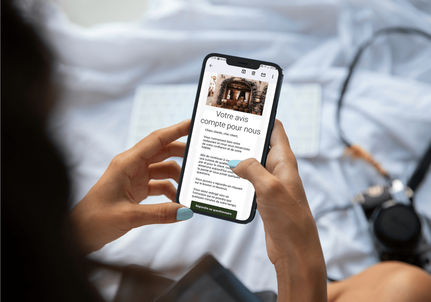
✔ A simple visual that speaks for itself: a photo of a dish, a friendly atmosphere, a banner with the offer. Avoid busy montages or generic visuals.
✔ A direct hook: a short, well-placed sentence that announces the subject. This is the title of your e-mail, so there's no need to warm up the subject line.
✔ The value to the reader: what's in it for him? A discount? A free meal? A guaranteed reservation? Tell us quickly and clearly.
An effective example:
Photo = a well-staged sushi platter
Teaser = "Tonight, we're giving away mochis for as little as €15 🍡"
Value = "Only for orders placed before 9pm".
Mobile-first: always test on a smartphone
Most e-mails are opened on the phone.
If your content doesn't display properly or takes too long to load, you've just lost a large proportion of your readers.
A few simple rules:
✔ Use a readable font size (minimum 14 px)
✔ Center blocks to avoid long lines
✔ Avoid text in images (it's not always displayed)
✔ Limit the number of columns: one is enough on cell phones
✔ Add space between elements for fluid reading
And above all: always test the mobile rendering before sending. An e-mail can look good on a computer and be illegible on an iPhone. You've got better things to do than lose clicks because the button is too small.
Step 3: Have a single objective for each message
Each e-mail must have a clear purpose. If you offer a new pizza, a competition, a themed evening and a discount on desserts all at the same time, you'll lose your reader.
Too much information = no action.
Avoid "catalog" or "catch-all" e-mails
It's a common reflex: you've got lots of things to say, so you put them all in the same e-mail. It's a bad idea.
A customer reads your message in a matter of seconds. If the content is all over the place, they won't know what to remember, or what to do.
In concrete terms :
✖ No full menu to pull down (unless it's a clickable PDF)
✖ No secondary info buried in the text
✖ No "oh yes, by the way, we also offer this" at the end of the mail.
Remember: one message = one expected action.
The right format for a promotion / a novelty / an event
Depending on what you're advertising, adapt the structure. Here's what works well:
For a promotion
✔ Short, direct hook ("This wekk-end, -15% on all takeaways")
✔ Dish or offer visual
✔ Clear button ("J'en profite")
For a novelty
✔ Emphasize what's in it for the customer ("New! You can now order in Click & Collect")
✔ Quickly explain how it works
✔ Encourage testing now
For an event
✔ Date + place highlighted right away
✔ What it will bring (concert, special menu, atmosphere...)
✔ Button to reserve or add to your calendar
Most important of all: keep it simple. You don't have to say everything in the e-mail. The rest you can put on your website or your networks.

Step 4: don't forget the well-placed (and well-written) call to action
Your e-mail has one purpose: to get people to click.
The action button (the famous "call to action" or CTA) is what turns a reader into a customer.
A good CTA is repeated (but not too often)
You can (and should) include several CTAs in a single e-mail, as long as the requested action remains the same.
For example, you can :
✔ put a button at the top after the hook
✔ relaunch with a text link at the bottom of the mail
✔ possibly add a final button
But avoid drowning the reader with 4 different buttons for 4 different actions. We click less when we hesitate.
Be clear about the expected action: book, order, come, etc.
Your button should say what happens when it's clicked. No vague "click here", "learn more" or "enjoy now". Specify the action, and keep your tone direct.
Examples:
➜ "I order now"
➜ "I reserve my table"
➜ "I activate the offer"
➜ "I'm coming tonight"
If you're sending an email to inform without immediate action, there's no need to add a fake button. In this case, offer a link to a post, a site or a map.
Step 5: Analyze the results and fine-tune your mailings
4 essential KPIs to track
Open rate
It tells you how well the object did its job. If the rate is low: the object didn't catch on, the sending time wasn't ideal, or the contact base is poorly targeted.
Click-through rate
It shows whether the content was clear and engaging. If the rate is low: the message was not convincing enough or the CTA was poorly placed.
Conversion rates
This is the most important. It measures how many readers actually booked, ordered or clicked through to the end. If this rate isn't keeping up despite clicks, review the landing page.
Unsubscribe rate
If too many people unsubscribe, it's a red flag. Either you're writing too often, or your e-mails aren't providing enough value.
Test and improve your formats
A good e-mail today may not work in 3 months. Habits change fast, especially when it comes to food.
Get into the habit of testing :
➜ Two different objects on the same campaign
➜ A short format VS a format with an extra visual
➜ A text CTA VS a visual button
➜ Mailings at different times of the day or week
Note what works.
Remove what doesn't fit.
Keep what clicks.
With the right tool, these tests don't take long. And in the long term, they help you reach your customers better, without ever spamming.
Ready to send emails that make people hungry (and convert)?
With Obypay, you can send targeted e-mails and SMS messages to your customers, directly connected to your data.
Do you have any questions about implementation or what you could automate?